Walker Design Office Reveal
We’re excited to reveal our new workspace! Walker Design has a new office space, and it is custom designed to meet our specific needs as a modern architecture and interior design firm.
The design objective was to create a space that functions specifically for us, while maintaining an aesthetic reflective of Walker Design’s philosophy and style. The design intent was executed through spatial delineation, materiality, and architectural elements.
The 2,160 SF workspace is composed of three major components: public interface, public / private engagement, and the private workspace. Thresholds clearly define the boundaries of each zone.
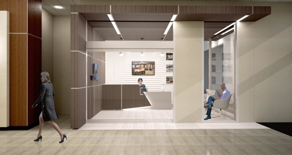
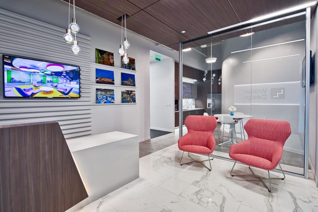
Architectural features are implemented throughout the office to define spatial boundaries. A wood feature element extends from the office into the public lobby, penetrating the extents of the office into the common area and creating a memorable first impression. The marble tile flooring slips past the threshold, welcoming visitors into the suite. Integrated lighting accentuates the lines of the custom millwork, and elegantly highlights the new brand signage.
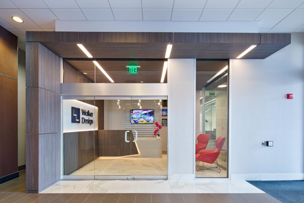
The wood plane creates a canopy overhead, clearly defining the reception area. Directionality and texture were masterfully utilized to reinforce spatial connections. The marble tile is rotated and shifts from matte to gloss finish, in alignment with the slat wall installation. These design details were carefully considered during the design process.
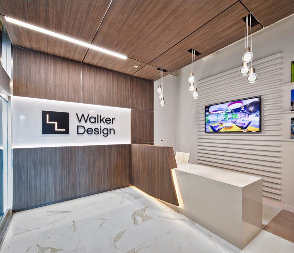
The slat wall installation frames a digital display, which showcases project work. Three slats gracefully extend to exhibit signature spaces. A single glass partition separates the café from reception, while maintaining visual connections. The glass mysteriously slips through a void in the wood, and decorative glass pendants hang between smaller voids over the reception desk.
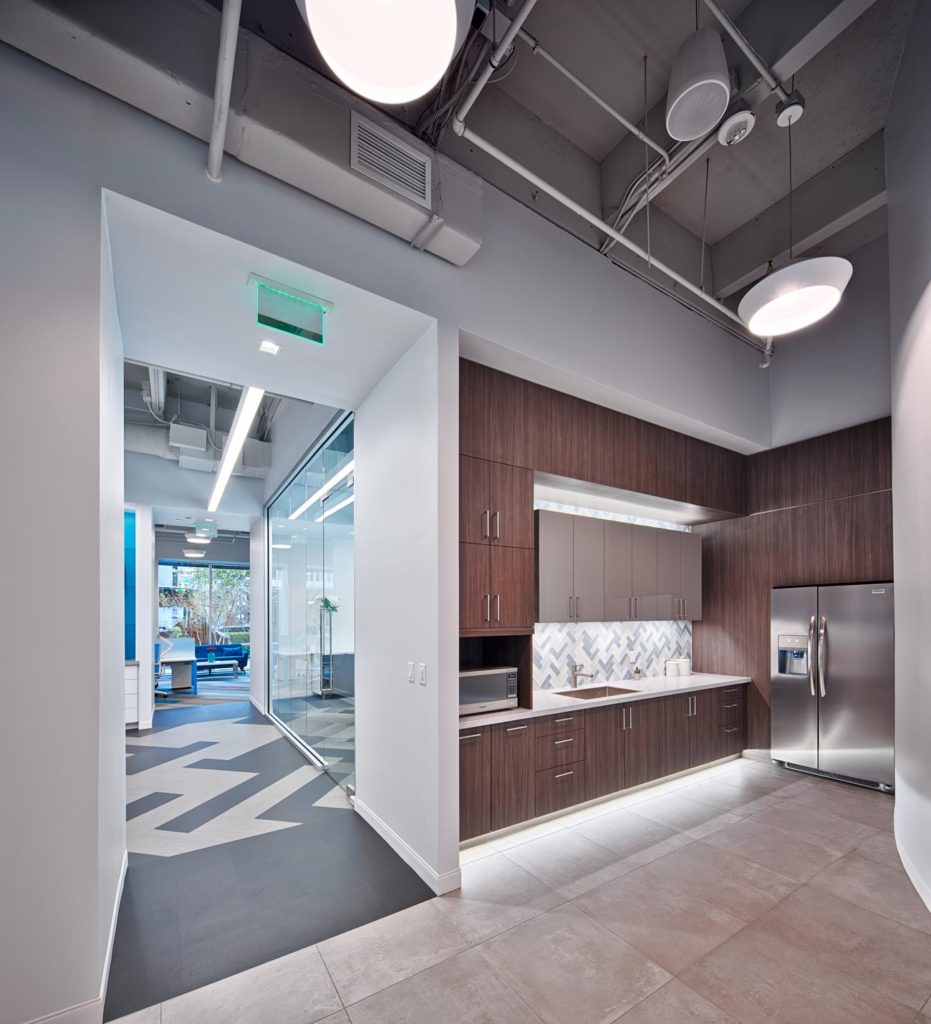
Warm and cool neutral finishes were used throughout the public interface to reflect the company’s refined design style. Lively pattern was introduced in the backsplash, which is replicated in the public / private engagement beyond the threshold. The stratification of space is defined through a series of thresholds, which is reinforced by both floor and ceiling planes.
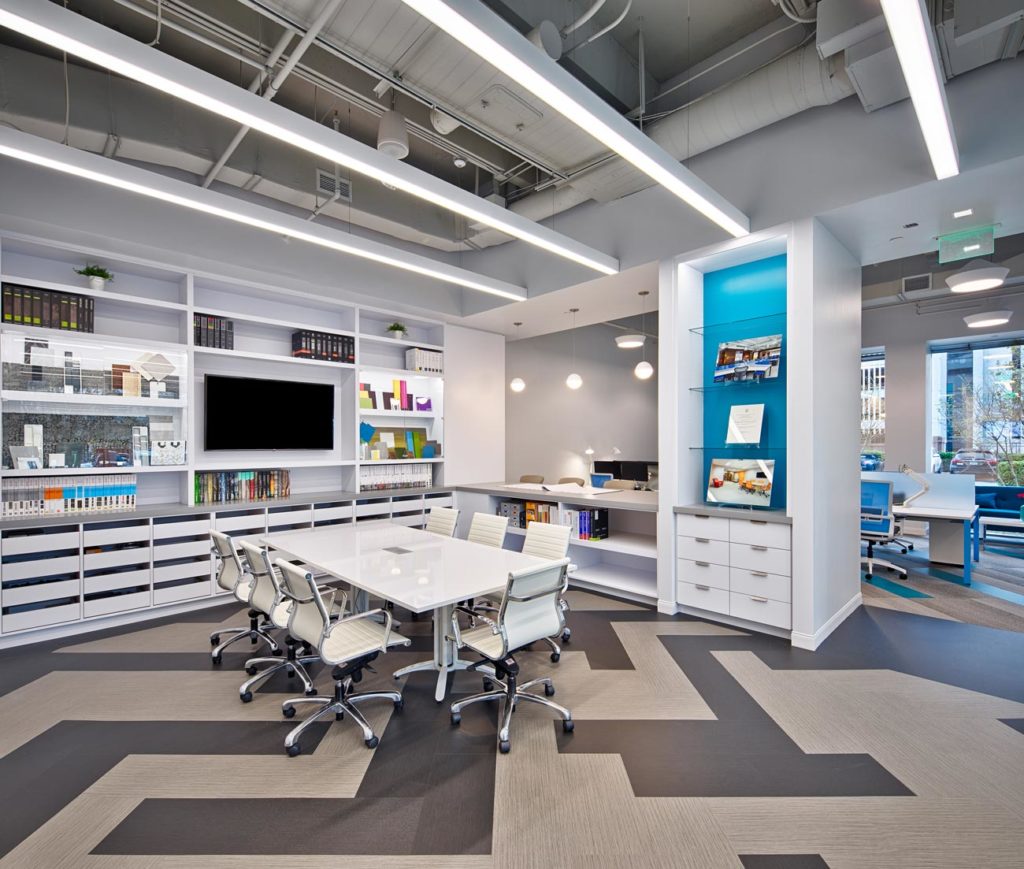
A dynamic and functional material library lies directly beyond the first threshold. Custom millwork provides ample storage, and display shelves with integrated lighting are used to showcase feature project designs. A digital display and conference table make this space functional as a secondary space for client and vendor interface.
Glass partitions provide a translucent plane that divides the space, while keeping continuity in materials and architectural features. This also allows natural light to penetrate the entirety of the public/ private engagement area.
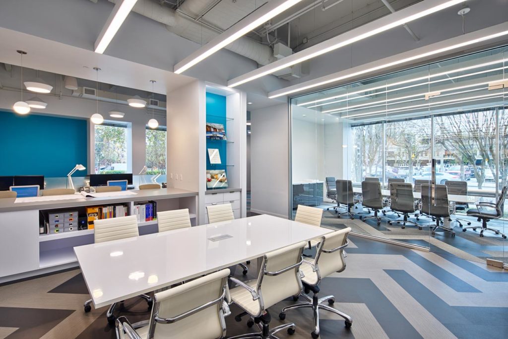
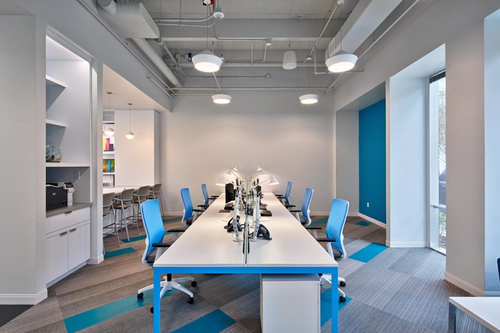
The private work space promotes collaboration and independent work by utilizing natural light and acoustic privacy from the rest of the office. Selective pops of color give this zone personality reflective of the company, and promotes creativity. The standing height bar is an open connection to the library, facilitating interactions between the two areas.
